Analytics Design Framework
Directing the Design of SalesLoft Analytics
Summary
The analytics product area of the SalesLoft platform was being heavily invested in and growing fast. This was in response to customer feedback indicating that our analytics features were basic and lagging in value compared to our competitor. As our platform team embarked on the challenge to improve our analytics, I identified an opportunity to lead the design of an analytics framework that would leverage our style guide combined with new reusable components from other areas of the platform to accelerate the development of our platform’s analytics and close the competitive gap.

Goals

System for modular and reusable analytics elements to increase the velocity of analytics panels being built
Creation of components for our design library so that analytics could be easily designed in other areas of the platform
Facilitate collaboration and mentorship between a tenured designer and a designer new to the team
Deliver valuable insights to our customers in a way that they could easily consume visually
Role
Design Direction
Team Management
Process
Armed with UX research insights and Product Management’s direction, the plan to improve our analytics was to give our users access to more data in more places and to display deeper insights and trends into the metrics they cared most about. We decided to extend our existing analytics structure from basic data tables and metric scorecards to a suite of dashboards with metrics and graphs.

Analytics panel components from the Sketch design library
Because I was uniquely positioned to oversee the design of the entire platform ecosystem, I was aware of some new components and design patterns that would fit nicely with our goals for analytics and expedite development time. I envisioned that the analytics design framework could include reusable and modular components with visual consistency and a more modern configurable experience for the user.
I also saw this as a growth opportunity for two designers who reported to me and for my development as a people manager. There was a designer new to the company and analytics team who was getting quickly immersed in the analytics subject matter and our Rhythm design system. I wanted to pair her with a seasoned veteran who wanted to develop his mentoring skills and who was also a whiz at creating design components for our design system. Although I have a deep passion for analytics and data visualization, this was an opportunity for me to step back and delegate, but also guide the direction of this initiative.
The designers met routinely and worked out their responsibilities, with the mentor taking on the creation of the panel components and the analytics designer creating a color palette unique to analytics and composing different configurations of metrics based on user need.
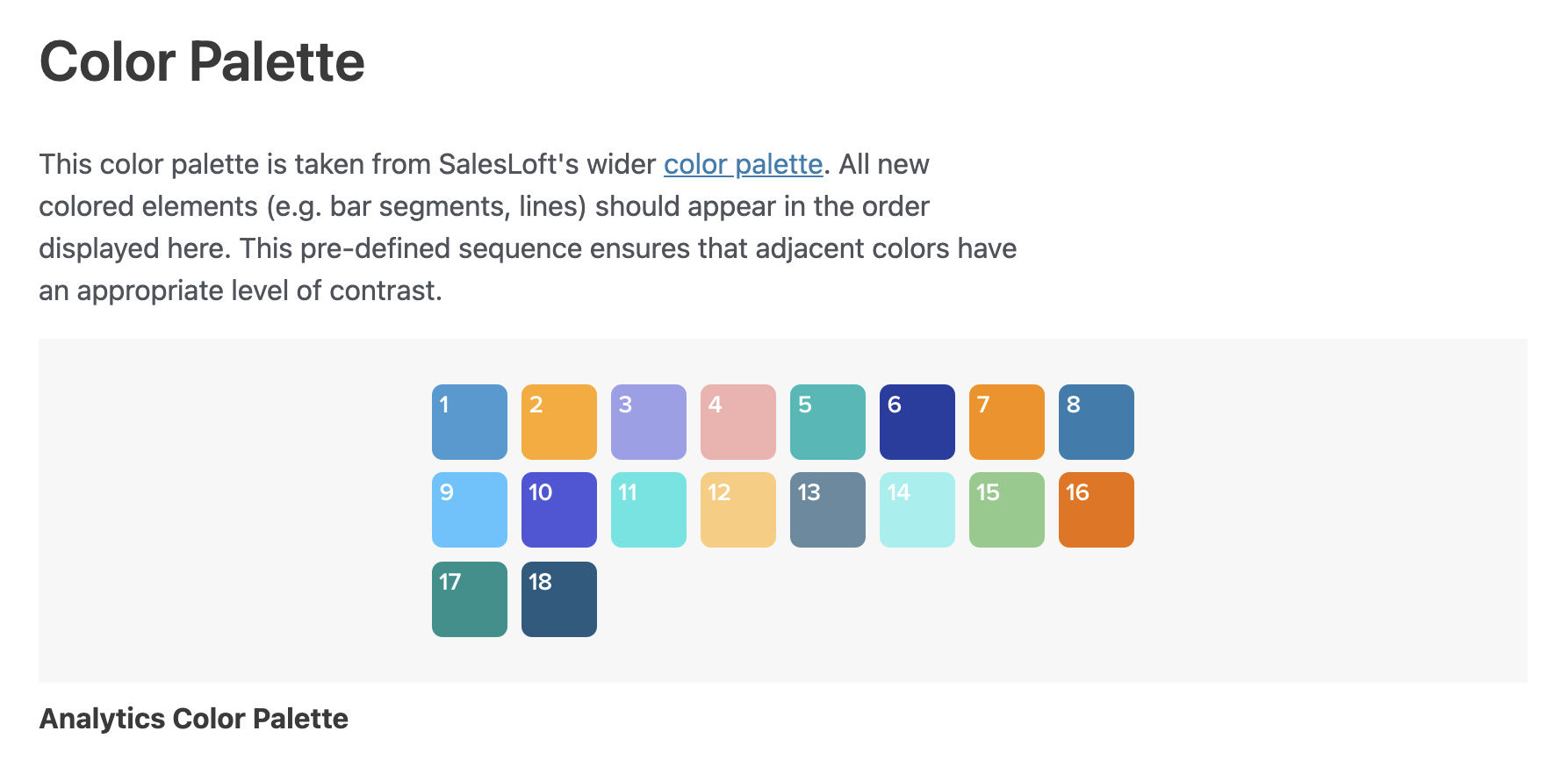
The biggest challenges the design duo faced were responding to shifting content requirements in response to user feedback and finalizing a color palette that could expand to account for up to 42 colors. After months of collaboration and iterating, the team built panels that could adapt to different content configurations and a color palette that would procedurally assign a different hue to each data point on a graph so that no two hues placed next to each other would be too visually similar to distinguish from one another. The analytics designer worked closely with the engineers on the team to understand the technical constraints of what could be delivered and she could ensure the components matched the proposed designs.

Analytics dashboards in production and conceptual renderings for new chart types
Outcome
The designers, engineers, and product manager on the project delivered on the vision of a configurable, modular analytics framework that our customers found valuable and visually appealing. On the peer-to-peer software review site G2, reviewers rated SalesLoft’s analytics reports and dashboards higher than our competitor after the release of this work.
By designing the analytics panels as reusable design and UI components, other delivery teams at SalesLoft were able to quickly add metrics in their product area, adding more value to customers’ workflows by having more data available throughout the platform.
Reflections
I am proud of the work the team did to collaborate and deliver a high-quality product, but there were opportunities for me to have done better in my role. The project was not moving as quickly as the delivery team had anticipated. The tenured designer was helping mentor in addition to his daily responsibilities and was having trouble finding time to dedicate to this project. And the new designer needed more guidance than was given to her. I could have intervened by either identifying a different seasoned designer who had the capacity to mentor, or switched the team assignments so that a more tenured designer could have helped complete the project faster. Another solution to complete the project faster could have been for me to propose a reduced scope that didn’t include configurable layouts, panel components, and a color system all at once.